
commonsku Refreshes Brand With Updated Logo And Mascot
commonsku (PPAI 552077) has announced and unveiled a brand refresh that brings with it a new look that will be familiar to those who have relied upon the business service provider but fits into a more contemporary aesthetic reflective of the company’s progress.
- The company’s initial main character/mascot, skubot, has been reimagined into a simplified version.
- The barcode that has always been part of commonsku’s logo remains with a deliberate change in color scheme.
A New (And Customizable Look)
commonsku, a cloud-based CRM, order management and social collaboration platform tailored to the promotional products industry, has chosen to keep the core of the designs that were a part of its initial launch but modifying those elements with fresh looks.
- Kate Masewich, VP of Marketing, led the brand’s refresh.
- Lucia Kim, lead designer, created the specific imagery.
The evolution of skubot, the company’s official mascot, can be seen in the image above.
- The original skubot was complete with a body and a friendly appearance.
- In its update, skubot 2.0 is more geometric and better fits into contemporary platforms and designs.
- Additionally, the new skubot can be customized to wink, wear sunglasses or appear with heart or stars for eyes.
The brand also chose to refine its color system and typography, while keeping the barcode that has been a signature element of its logo and brand.
What They’re Saying
Mark Graham, commonsku’s president and chief brand officer, says that the rebrand was a long time coming to signify the progress of the company.
“Over a decade has passed since we first launched our brand and our beloved mascot, skubot, and now, we’re thrilled to launch a brand-new refresh architected by our vice president of marketing, Kate Masewich, and created by our lead designer, Lucia Kim,” Graham says.
According to Masewich, the changes are meant to reflect a balance between the company’s original intentions and its growth and evolution.
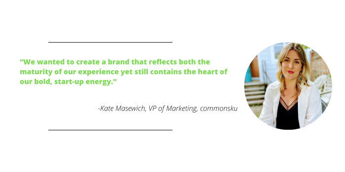
“From our early start-up days to today, we’ve seen a tremendous amount of maturity,” Masewich says. “And now, with over 750 customers that power over $1.5 billion in distributor network volume, our brand has outgrown its startup roots. We wanted to create a brand that reflects both the maturity of our experience yet still contains the heart of our bold, start-up energy.”
Graham hopes the change is a symbol of what will continue to be at the heart of commonsku’s core missions.
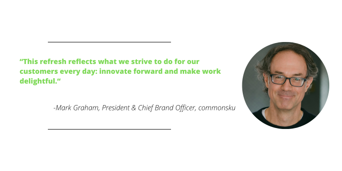
“A brand refresh reflects more than just a cosmetic change,” says Graham. “It represents our commitment to evolve and grow; just as our platform reaches the forefront of tech innovation, our brand, too, strives to always speak to tomorrow’s promotional professionals with a voice and image that conveys the essence of our values. Two of our core values are making work delightful and creating momentum through fast-forward energy. This refresh reflects what we strive to do for our customers every day: innovate forward and make work delightful.”