Water Cooler: To Type(ography), Or Not To Type(graphy)

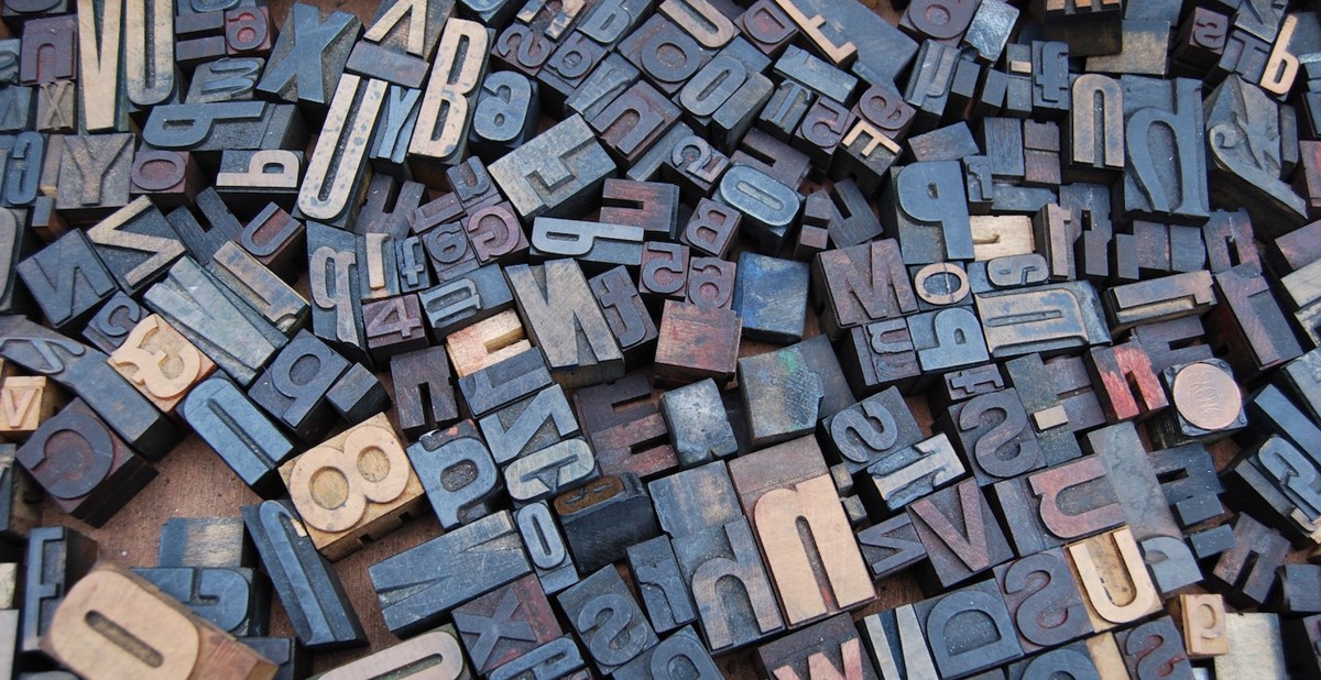
Photo: Amador Loureiro / Unsplash.com
It certainly goes without saying that typography plays a critical role in brand messaging, perception and recall. Typography is so powerful that the difference between a perfectly designed logo, which accurately reflects a brand’s mission and feel, and messaging that is generic or—yikes!—poorly designed, can determine whether that company receives the attention and business it deserves. There’s certainly no shortage of internet memes about when typography goes wrong: think Chanel’s “I love Coco” advertising campaign, which read “I love Cow” because of a poor typeface selection.
Looking ahead, The Word Counter blog—a blog used by copywriters and digital marketers to count the characters in their social media posts—compiled a list of eight typography trends we’re sure to see in branding this year, and the international companies and professionals already using them.
1. Svelte serif fonts: Serif fonts are decorative, but the embellishments are also what make for easier reading, particularly of longer passages. Svelte serif fonts are often described as timeless, and due to their delicate look, these fonts are a favorite for beauty and direct-to-consumer brands. Companies using it: Neuebel, a web-based font foundry, and Netherlands-based LOFF Wellness.

2. Outline fonts: Fully transparent in the middle with room to play on border thickness, outline fonts look just as they sound. They’re great for making a statement, directing the eye and drawing attention in a way that’s not overwhelming. Companies using it: Japanese designer Ukyo Masuda and Aldo’s Step Into Love campaign.

3. Evolved Brutalist: Brutalism was a popular architectural style during the late ’50s through the ’60s, known for its purposeful simplicity, rawness and transparency, which creates an ominous, grim feeling. The evolved Brutalist style takes elements of traditional Brutalism, like the clean, sharp edges, and adds retro elements, including an array of colors and shapes, for a much different feel. Companies using it: New Zealand-based Porter Packaging and Chinese interactive designer and developer Nathan Taylor.

4. Text laying with other elements: Drawing on collage-like references, this style allows brands to experiment with purposefully layering text and images, which almost serves as eye candy that interrupts users’ scroll. Companies using it: Mammut Baikal, an expedition documentary, and Poland-based Owlsome Studio.
5. Text-image blending: This style merges together the text with the image or graphic, representing the two as inseparable. Unlike the look of a collage, text-image blending makes it near-impossible to distinguish where the text ends and the image begins, in some cases, for a super fresh look. Companies using it: London-based Satellite414 and Craig Reynolds, a New York-based photographer and art director.
6. New psychedelic: A mishmash of design elements from the flower power days and the present—anticipate tie-dye and psychedelic-like prints and color combinations paired with “melting” font (think Wes Wilson) typography-heavy designs (think Victor Miscoso). Companies using it: Minneapolis-based Zeus Jones and French graphic and interactive designer Charlie Le Maignan.

7. Bold modern sans-serif fonts: A recognizable, simple look but with a new charm, modern sans-serifs are being incorporated in design as a larger-than-life, oversized effect, overtaking screens and sometimes the entire design itself. Companies using it: Canada-based Spline and German agency Pizza Pizza.

8. Cyberpunk and vaporware: One of the more disruptive styles, this trend draws from the development of computers and digital games in the ’80s, and is thus characterized as an elusive grouping of video games, computers and ’80s pop. Companies using it: Next Big Thing Academy, a venture studio, and Buoy, an Japanese illustrator.

–––––––––––––––––––––––––––––––––––––––––––––––––––––––––––
Danielle Renda is associate editor of PPB.

