
Only The Best: Pyramid Marketing Winners

Every marketing effort begins with an idea and a goal to solve a problem, to be memorable, to get results. These 12 projects started out that way—and then soared to unexpected greatness, winning a PPAI Pyramid Gold Award for Marketing at the PPAI Expo 2019 in January.
 Thirty-three member companies were recognized for exceeding excellence with their innovative and solutions-driven entries in seven categories including branding, catalogs, sales and marketing aids, electronic catalogs, end-buyer sales and marketing aids, integrated marketing and self-promotion. Read on to learn about 12 marketing projects that won gold and 21 that won silver.
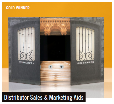

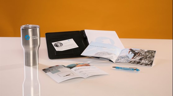
Supplier Global Promo created a video book marketing tool for distributors. It replaces random, imprinted samples with a highly effective marketing tool that shows the value and impact of the video card promotional product. Samples of this item have been shared at trade shows and through mailings to Global Promo’s partners along with target email campaigns.
This marketing aid features a high-definition seven-inch LCD screen, hardstock cover and a bi-fold window. When prospective clients open the cover, a sample video begins showing the distributor’s logo, then transitions into the sample videos. Bullet points illustrating why video works for marketing campaigns are printed on the left inside flap, while the sample videos show a range of video applications from hospitality to luxury transportation. On the right inside flap, a business card holder stores the distributor’s business card, reminding clients who provided the sample.
The video cards provide an exciting way to share important information by combining full-color graphics and video technology. This tool has been used to launch new products, take clients on virtual tours, make sales pitches, educate patients and providers, and for political campaigns and fundraisers. They have even been used as wedding invitations to share the love stories of brides and grooms.
––––––––––––––––––––––––––––––––––––––––––––––––––––––––––––––––––––––
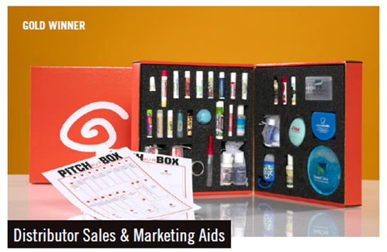

The Pitch-in-a-Box was first introduced to the supplier’s sales team as a sales and marketing tool. Over time, it was used as a sales and marketing tool by distributors as well. The original box was one-sided and contained a small sampling of products from just a few of the company’s SKUs. It is now a larger, double-sided kit containing products from every SKU including broad spectrum and all-natural lip balms, organic lip balm, all-natural lip shimmer, hand sanitizers, sunscreens, lotion, a plush hot and cold pack, a gift set and a retainer case. An insert outlines promotional uses and ideas for each product, giving the distributor a competitive marketing edge when using this tool in client meetings. The box can be easily mailed and handed to distributors during face-to-face sales meetings. All the products in the box are decorated with end-user-friendly labels and imprints, and are cushioned in a custom foam insert for a polished presentation. The box’s bright orange color is consistent with Raining Rose’s brand and highlights its products in a professional and easy-to-use manner.
––––––––––––––––––––––––––––––––––––––––––––––––––––––––––––––––––––––
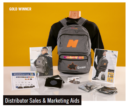

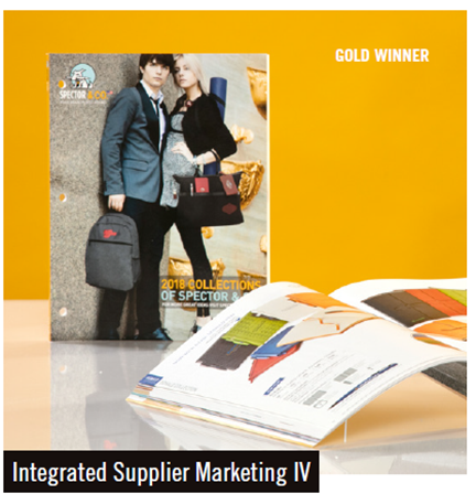
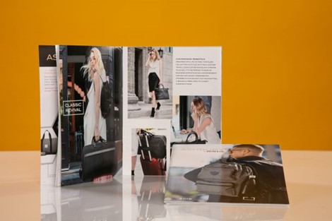
The objective was to provide distributor partners with a compact, easy-to-transport marketing aid to educate end users about the Ashbury bag collection. The unique branding options were showcased by decorating a best-selling Ashbury backpack with originally designed logos, within a common theme, and offering multiple branding options and numerous branding locations.
To support the promotion, a coordinated hang-tag detailed the locations and decorating methods on the sample bag. Tucked inside were an Ashbury catalog, a printed guide card and assembled swatch books loaded with step-by-step procedures on creating customized BrandShields and BrandPatches. Corresponding patch samples were sewn onto actual fabric samples from each of the Ashbury collections.
The format of the swatch books allowed distributors to customize their sales calls and provide instant samples to end users by either sending them a specific patch or presenting, in person, a swatch indicative of the exact bag material and stitching they were interested in purchasing. This saved time by not having to request an entire bag sample from the factory.
The Spector sales force hand-delivered 500 bags to distributors selected based on their potential for growth in this product category. The company tracked the sales of its BrandShield and BrandPatch decorating options, along with the growth of the targeted distributors in this bag category—both of which have reported a steady rise in sales.
––––––––––––––––––––––––––––––––––––––––––––––––––––––––––––––––––––––
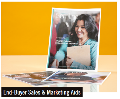

Gemline developed eight in-depth, cross-market, end-user case studies that address the common problems end users face within specific industries. They are designed to help distributors uncover more selling opportunities. One of the case studies focuses on nurse retention and career satisfaction while decreasing recruitment costs by reducing the need for new talent. In conjunction with other strategic initiatives, the case study shows how branded promotional products helped simplify daily tasks, reduce on-the-job stress and promote healthy living.
Another case study is targeted to customer satisfaction and employee retention programs in the hospitality industry. A third case study supports nonprofit organizations’ fundraising efforts by increasing awareness and engagement.
The full set of case studies is available on the supplier’s website and can be downloaded, customized and shared.
––––––––––––––––––––––––––––––––––––––––––––––––––––––––––––––––––––––
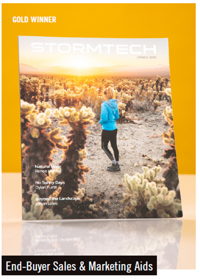

Stormtech magazine’s objective is to tell the supplier’s brand story to end users in a creative and aesthetically pleasing way. It uses stunning outdoor photography showing Stormtech products in all climates along with editorial-focused articles that are relevant to the Stormtech brand but not necessarily intended to sell outdoor gear.
The product collection concept categories, such as Steady Transit for the travel collection and Let it Rain for rain gear, were introduced and then repurposed on the website landing page and in email marketing materials.
Print and digital versions of the magazine are available. The oversized nine-by-11-inch print version was produced with high-quality finishing details such as a soft-touch aqueous-coated cover. A limited run of hardcover copies were also signed by Stormtech’s founder.
In addition to the publication, Stormtech undertook a new rebranding project. Working with an internationally recognized creative agency, Stormtech overhauled its brand architecture, logo and wordmark, photography standards and style, typography, iconography, color usage, material language and copy writing. All of these elements made their debut in the Spring 2018 magazine.
––––––––––––––––––––––––––––––––––––––––––––––––––––––––––––––––––––––
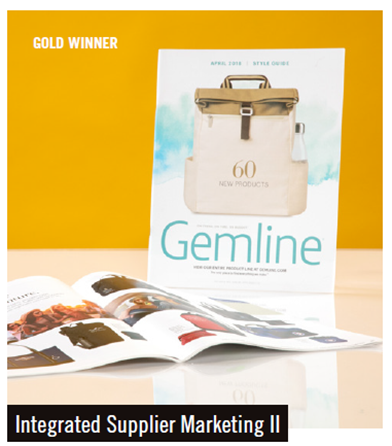
Gemline’s integrated print and website strategy is built on the cohesiveness and functionality of two impactful sales tools: a printed catalog and a robust website. The basis of its integrated strategy is to provide customers with look-book type style guides three times a year featuring new products, lifestyle imagery, trend information, pricing and limited product descriptions and decoration.
The guides are intended to drive customers to the website to view the entire product collection that includes videos, sales flyers, collections and other sales tools. This shift in strategy has allowed Gemline to continuously launch new items throughout the year without the burden of an out-of-date catalog. With fewer products to feature, the style guides have become creative and exciting, with a retail look and feel, and product spreads filled with lifestyle and product images and ads.
In 2018, Gemline began providing curated collections of products based upon category, brand, feature and vertical market. Distributors can also create their own custom assortments using these online sales tools, which allow for quick and easy browsing, and sharing of content and ideas.
––––––––––––––––––––––––––––––––––––––––––––––––––––––––––––––––––––––
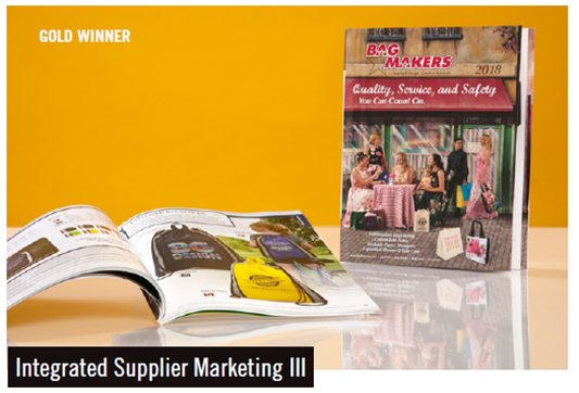

In 2018, BAG MAKERS introduced a completely revamped product catalog that is strategically integrated with its online content.
Enhancements to the print catalog include a fold-out cover; a color-coded table of contents; products grouped by material and/or functionality with new products showcased up front; and simplified product information grids highlighting each product’s price by imprint process, along with key dimensions and material details, shipping information and imprint area sizes. Improvements also include fresh product descriptions featuring call-outs and suggested product uses; new lifestyle photography with an emphasis on how the bags can be used; comprehensive order information and art specs; and new sales tools including a spread showing how the perfect bag and imprint exists for every occasion and budget, plus a related case study. The print catalog is interconnected with many helpful online resources, including videos, customizable e-catalogs, flyers and more.
––––––––––––––––––––––––––––––––––––––––––––––––––––––––––––––––––––––
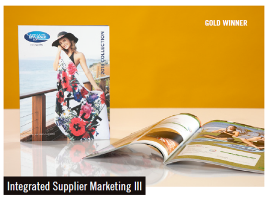

Terry Town recognizes that industry catalogs need to include extensive information about decoration, set up, colors, etc. To determine the best way to present the information clearly, the company consulted its customers before starting work on its new catalog and the website that supplements it.
Among the enhancements were simplified product descriptions with bullet points that highlighted features and specs; color-coded pricing based on product categories and imprint methods and updated photography for all products, including lifestyle images instead of simple product shots. This allows distributors to get a better idea of how products can be used and what markets to approach.
The catalog is complemented with the company website that mirrors the flow of the catalog. In addition to more information, it provides a variety of tools for distributors to promote products such as downloadable images, templates, a catalog and sales flyer creator, a freight estimator and the ability to create virtual mock ups, request quotes and samples, and share information and photos on social media.
The site also features a dashboard where customers can save items, create projects, take notes and keep track of sample and quote requests.
––––––––––––––––––––––––––––––––––––––––––––––––––––––––––––––––––––––
The catalog shows lifestyle images and large product photos featuring packaging, gift sets and practical applications for the products. The opening spreads are dedicated to branding options and collections. Colored bars on the tops of pages identify each product category section.
Recognizable icons on each page symbolize decorating, refill and production options, and each item includes a price grid, default branding set-up charge, standard packaging and product dimensions. A numerical index and a useful summary of conditions of sale are placed in the back of the catalog.
Each product catalog page references the website where full product and branding details are located, including images of each branding option and every decorating location. Distributors will also find case studies and product videos for a selection of products, and an interactive live chat with a customer service account manager is available along with a freight calculator tool, online sample order form and a request for proposal option.
The catalog is offered in a full-size and mini version.
––––––––––––––––––––––––––––––––––––––––––––––––––––––––––––––––––––––
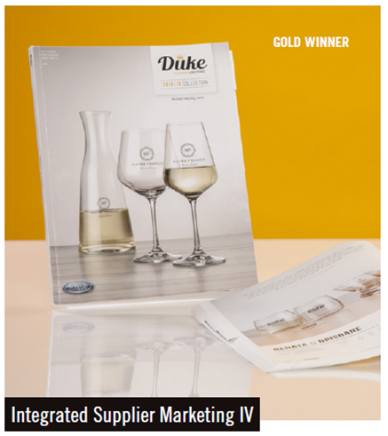

The Duke Custom Cresting catalog features the newest addition to the St Regis Group of Companies with a focus on imprinted drinkware and barware. As the first catalog for the brand, it was paramount that the overall design portray the elegance and contemporary style of the brand, and one that recipients would be proud to display in their own kitchen or wet bar.
Stunning product photography is the centerpiece of this catalog starting with its table of contents showcasing six categories: ceramic mugs, glass mugs, stemware, barware, pilsners and steins, and giftware. Inside, each page shows a single product, allowing the reader to focus on details without being bombarded with choices. The lifestyle images on every category introduction page focus on thirst and drink preparation such as coffee being brewed, wine splashing into stemware and sipping from a glass mug. Clear glass products were photographed using props to help the end user envision the product on their dining or coffee table.
Each section features clever introductory descriptions to help users find products along with section tabs on the right edge of the pages to aid navigation. With a goal for consistency throughout the catalog, every product page includes all pertinent product details, specs, pricing and packaging images that have proven to be considerable sales aids for distributors.
––––––––––––––––––––––––––––––––––––––––––––––––––––––––––––––––––––––
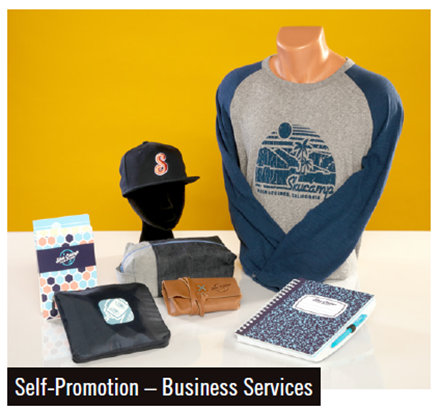

commonsku designed the gear for its inaugural business bootcamp, skucamp, which attracted about 100 promotional products entrepreneurs. The objective of this event self-promotion was to use products from the sponsors in a unique and creative way that would impress and inspire attendees and help ignite their imagination to think creatively about how promotional products can be used at their events.
Attendees were presented the gear when they arrived at skucamp and were greeted by a small pop-up shop featuring all the skucamp products creatively displayed to enhance the aesthetic of the event. Included were custom pennants featuring every supplier’s name in an old school font.
Since the event was hosted partly outdoors at the sunny and eclectic Ace Hotel in Palm Springs, a camp aesthetic was part of the theme. In addition to the products pictured, event gear included campfire mugs, sunglasses cases, sunscreen and lip balm and s’mores kits for use around the firepits.
The reward for conference organizers was the surprised and delighted looks on attendees’ faces and more than one compliment saying, “This is swag done right.”
––––––––––––––––––––––––––––––––––––––––––––––––––––––––––––––––––––––
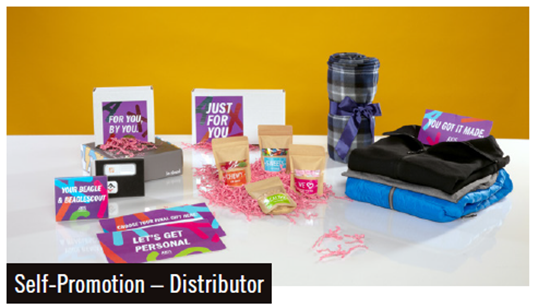

In a time when personalization is becoming more and more popular, Axis set out to do three things: demonstrate its ability to combine hyper-personalization with state-of-the-art technology and stellar promotional products, show clients appreciation and celebrate another successful year with customers.
Axis sent more than 1,700 of its best customers an email with a link to a special microsite where they were asked to complete a survey asking their birthday and apparel size, along with their favorite candies, color and charity, which Axis would donate to.
Next, customers received a box labeled “Just For You,” filled with their favorite candies in personalized pouches. As an extra special gift, 757 VIP clients also received a link to a gift store where they could choose a high-end item and customize it to fit their style. Products included bluetooth headphones, a bluetooth speaker, a powerbank, a smart button, a tumbler, three jackets in men’s and women’s styles, a pair of luggage tags, a blanket and a fitness tracker. Clients then chose their customization and every gift was packaged with custom labels and drop shipped to their chosen location for a truly personalized gifting experience.
Axis received an overwhelming 85 percent redemption rate and continues to leverage strong partnerships with clients in every niche and market.
––––––––––––––––––––––––––––––––––––––––––––––––––––––––––––––––––––––


DistributorCentral redesigned its logo to replace outdated and confusing imagery and give customers and prospects a cleaner, clearer message. The original logo used a combination of a solar eclipse and an arrow but the meaning of the eclipse had lost its original meaning and the arrow was pointing downward—subliminally giving the wrong message. A team of five reviewed a range of options and ultimately made modest changes: removing the eclipse and flipping and inverting the arrow while leaving the fonts, spacing and original colors. The change retained the history of the brand while ensuring the appropriate message was being portrayed. It took DistributorCentral about two months to roll out the new logo across all locations and update the logo on business cards, flyers, external website, dashboard user interface, page loading spinner, trade show booth, social media channels, giveaways, internal artwork and the building sign.
–––––––––––––––––––––––––––––––––––––––––––––––––––––––––––––
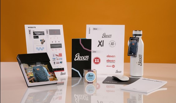

Since 2014, the company’s brand had evolved but didn’t represent its core belief in a clean, quiet and minimalistic approach to design, and didn’t differentiate it from the thousands of other distributors. The year-long rebrand was a cohesive collaboration between President and CEO Oliver Gagnon, who provided the vision, and two design agencies who executed it into tangible deliverables. Several clients were consulted during the process and their advice helped shape the strategy.
What resulted was a complete overhaul of the brand including messaging, unique selling proposition, brand identity and marketing collateral—no aspect was left untouched. The website was completely redesigned, all messaging was written to reflect the new brand culture and every element of our marketing collateral from stationary to merchandise was redesigned and introduced into the marketplace to reflect a new and improved brand persona.
–––––––––––––––––––––––––––––––––––––––––––––––––––––––––––––

Since 1988 Terry Town has been known for holding high-quality standards and developing innovative products, its branding needed to communicate these same values.
The first step of the plan was to change the logo which had a nautical coloration theme and was a better reflection of when it was primarily a towel company. Now with a product line that included blankets and home accessories, the logo needed to be more retail and less seasonal, and showcase a strong commitment to social compliance and product safety with a fresh, modern look. The new logo, with its soft script font and earthy blue tones, reflects a young and energetic Terry Town.
The website redesign, which took almost two years to complete, injected a new life-blood into the company. Flyers, email signatures and trade show booth all received a much-needed facelift but the biggest change was updating the catalog to make it lifestyle-focused showing promotional products in action.
–––––––––––––––––––––––––––––––––––––––––––––––––––––––––––––
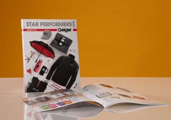

The Geiger Star Performers Catalog is one of the highest-rated tools available to the Geiger sales force and offers end buyers an annual crosssection of products available in the industry. True to its title, sales are tracked for the 250 products and those that underperform are replaced the following year. Despite the increased popularity of electronic media, Geiger prints 20,000 copies of the 64-page catalog—a quantity that’s remained consistent over the years.
The color-coded table of contents matches up with the section backgrounds to make navigation quick and easy. Icons for ‘made in USA’ and ‘earth-friendly’ appear where applicable throughout the catalog. Geiger’s commitment to product safety is shown on page three with a link to an online page containing product safety measures to insure compliance with all safety regulations. All products are cross-referenced on Geiger’s ecommerce site with an identifying Star Performers icon. The catalog is available electronically as well.
––––––––––––––––––––––––––––––––––––––––––––––––––––––––––––––––––––––
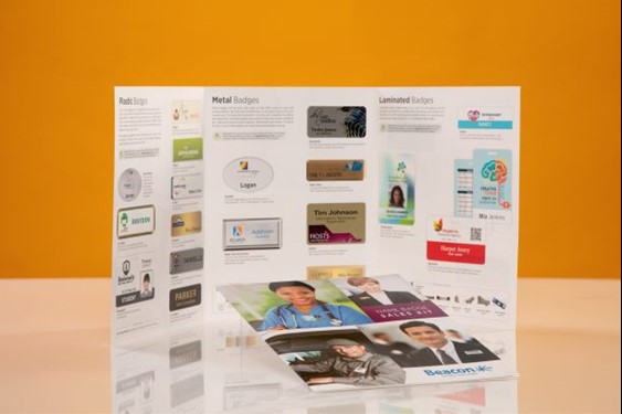
![]()
The name badge sales kit demonstrates the differences in badge materials, printing methods, personalization methods and doming options, and is a great tool to educate end users. And because the kit doesn’t contain prices, it can be left with an end user.
The tri-fold badge kit folder contains name badge images, eight samples and descriptive copy about the badge line. The samples are a variety of plastic, metal, laminated and reusable badges so the end user can touch and feel the different types of badges versus viewing a photo in a catalog or on a website. The kits are handed out at shows, distributor meetings and mailed out as requested.
––––––––––––––––––––––––––––––––––––––––––––––––––––––––––––––––––––––
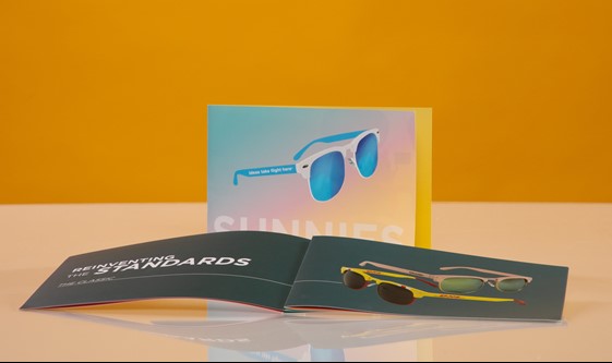

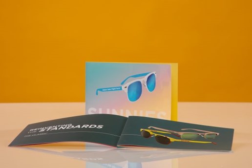
In collaboration with Jack Nadel International, supplier Pop! Promos created a 32-page catalog featuring information about all of the sunglasses in the Pop! line. Jack Nadel used this tool, along with a custom, Pantone-matched sunglasses self-promo, to highlight and educate their sells reps on all the product options available from this supplier.
The catalog highlights the message that the sunglasses in the Pop! Promos line can truly have endless imprint and design capabilities, and are applicable to any event or giveaway. It also informs salespeople about the color options beyond a single color imprint.
––––––––––––––––––––––––––––––––––––––––––––––––––––––––––––––––––––––


The 30-page Geiger-branded Timeless & Trendy Holiday Gifts electronic catalog contains new and unique products to help generate holiday gift ideas and inspire customers to be creative with their corporate gift-giving. With its on-trend, retail-inspired design, this holiday gift collection is a conversation starter and idea generator.
Products within the e-catalog are alphabetical by product grouping type, and it also includes holiday recipes, fun tips and ideas for enjoying the season.
Because it’s an electronic catalog, it can be shared through email and social media, and even embedded into email signatures and custom ecommerce sites. Featured functionality includes easy zoom in/out for close up and full-screen views, and ability to print a page and direct customers to a specific page. Enhanced search capabilities, page bookmarks and note pages are other functions of this award-winning catalog.
––––––––––––––––––––––––––––––––––––––––––––––––––––––––––––––––––––––
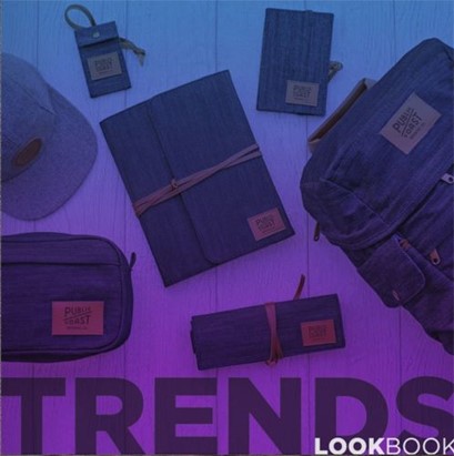

The TRENDS LookBook (http://thepopshop.com/trends) was created to elevate the distributor as a creative resource and expert on trending merchandise. It contains an inspired collection of seven retail-driven trends displayed through beautiful lifestyle images. Trend spotting is a year-round mission for distributors and identifying new and incoming trends positions distributors as creative resources and experts on trends.
The e-catalog, published in March 2018, is designed to be used throughout 2019 and to be distributed through email, social media, mailers, the website and during live product presentations with select clients.
Exhaustive research went into assembling it including social media, online shopping, retailers, markets, promotional industry, supplier trend reports, fashion reports and a variety of consumer trend and forecast reports.
At more than 50 pages, products are organized across seven broad trends and brought to life with retail-style photography for a fashion-forward approach. The design is clean and colorful to support the fun and edgy content. The square shape of the book is refreshing and smart but, as the user flips, it opens to a wide spread, nicely filling the wide orientation of a monitor. Most impressive is the clickable content, which sets this e-catalog apart from others.
––––––––––––––––––––––––––––––––––––––––––––––––––––––––––––––––––––––
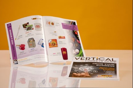

The 2018 Vertical Markets Guide is a printed piece distributed at trade shows, via sales reps at one-on-one meetings and by request in the iCatalog® Center. Its purpose is to help grow distributors’ businesses to secure sales with market specific ideas and best sellers aimed at industries that are the top purchasers of promotional products.
The 50-plus page guide shows more than 200 product ideas tailored to 24 end-user markets (including education, healthcare, business services, insurance, nonprofit and trade shows) along with interesting facts on each highlighted industry. The products showcased within each vertical market were selected using data-driven research to provide items to build appealing campaigns within each sector. Individual pages are also available as pdfs so distributors can easily add their logo and email them to clients.
––––––––––––––––––––––––––––––––––––––––––––––––––––––––––––––––––––––
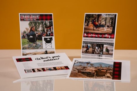

TravelChair’s “What’s Your Outdoor?” campaign embraces the idea that as society continues to embrace the outside world, the concept of “getting outdoors” has evolved. No longer is it limited to gear heads trekking to obscure destinations. Getting outdoors is now a day at the lake, a Little League ball game or a barbecue in your own backyard. It is more attainable than ever and, as a result, more and more people are finding their own way to participate. This transfers to the promo world where long-term branding is the goal. The marketing campaign pushes people to consider not only the initial impact of the product, but its continued use. The foundation of campaign is carried through marketing (visual and informational), show presence (staff in red buffalo plaid attire), and in the product line. Standard virtuals are upgraded with lifestyle photos and plaid is used throughout the campaign to evoke a feeling of nostalgia and to provide a connection to the idea of being outdoors. By providing education rather than just products and pricing, distributors are armed with tools to inspire their clients.
––––––––––––––––––––––––––––––––––––––––––––––––––––––––––––––––––––––

Spector & Co.’s 52-page catalog showcases a new product category division with lifestyle images, product descriptions, full pricing and decorating information resulting in an easy-to-use reference guide with familiar navigation..
Each product catalog page references the coordinated website for full product and branding details, case studies and product videos available for a selection of products. The website also provides an interactive live chat, a freight calculator tool, an online sample order form and an option to create a proposal.
––––––––––––––––––––––––––––––––––––––––––––––––––––––––––––––––––––––
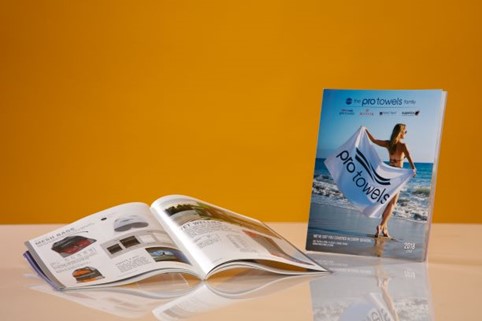

The 2018 Pro Towels Family Catalog is the first catalog representing all the company’s brands with a cohesive style and flow showing products that cover all seasons from towels (Pro Towels) to flip flops/footwear (Neet Feet) to blankets (Kanata Blanket Co.). There are also clear deliniations between each section, and product categories are easy to follow with new products first, followed by bestsellers and products sorted by weight/size.
Throughout the catalog there are reminders about kitting opportunities and companion items along with a great mix of lifestyle and standard product photography. The online categories and the website are designed to flow like the catalog giving the customer an easy and consistent experience. Online customers will find many more resources to help in their purchasing decision like virtual creator, all color images available, decoration/art templates, videos, image downloads, and a freight estimator.
––––––––––––––––––––––––––––––––––––––––––––––––––––––––––––––––––––––
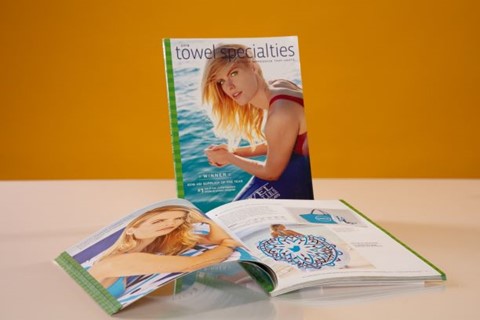

Most of the catalog spreads in Towel Specialties’s new book feature a “master fashion shot” of the product with additional photography or color dots to illustrate available colors on the opposite page. The price grid gives basic information and refers customers to more detailed information in the back of the catalog. The catalog also explains complicated Tone on Tone Decorating on colored towels with a color chart so customers can see ink color/towel color combinations. The website mirrors the catalog in how product categories are prioritized and presented. Since the same categories appear in both, customers can find product suggestions more easily when moving from one to the other.
––––––––––––––––––––––––––––––––––––––––––––––––––––––––––––––––––––––
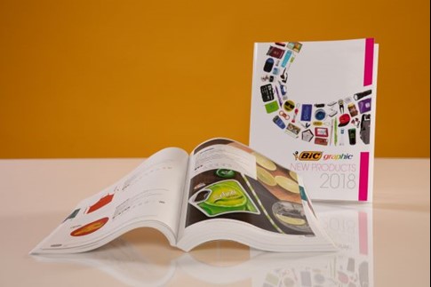

Content within the BIC Graphic Catalog Collection is conveniently arranged by product category, brand and price point. Key product families are highlighted with lifestyle photography and some key products are shown in “exploded views” indicating the components of the item. Complete product information, including decorating and imprint options, are on each product page so users have everything they need at their fingertips. Icons are used throughout the catalog identify key features available with each item. For example: free 24-hour service, guaranteed inventory, Made in U.S.A., exclusive designs, etc.
In addition to the information in the printed catalog, the website also allows customers to:
View iCatalogs, current promotions, product or category videos and inventory, and search by category, brand, vertical markets, new products and more.
––––––––––––––––––––––––––––––––––––––––––––––––––––––––––––––––––––––
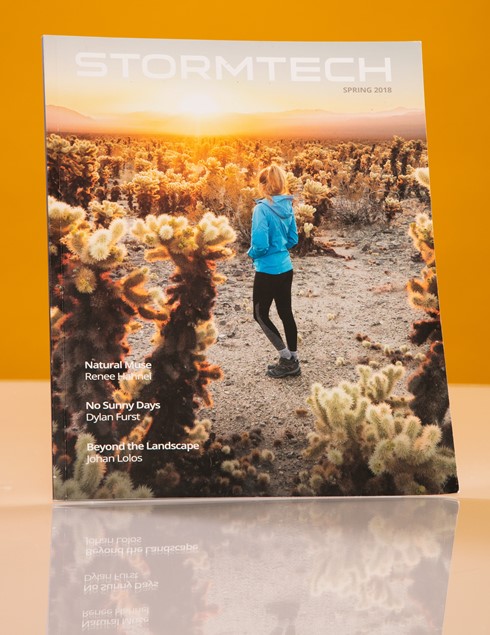

Stormtech’s 2018 catalog features new navigation, creative direction and stunning photography taking customers on a visual journey from cover to cover. It navigates through all product categories supported by creative graphic design and key product information. It also provides a variety of online and offline tools for customers to help them make an informative presentation and sale.
––––––––––––––––––––––––––––––––––––––––––––––––––––––––––––––––––––––
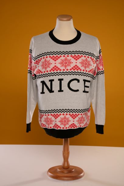

Red Tomato wanted to boost sales, attract new clients and increase client and social media engagement for the end of the fiscal year (June 30), so it decided to use a bit of Christmas magic. Coupled with the promotion was an internal sales incentive to attend the PPAI Expo in Las Vegas.
It developed an ugly sweater contest, coupled with a online campaign, related landing pages, social media plan and sequential email campaign. The sweater competition was aimed at engaging existing clients who were invited to vote for their favorite ugly sweater from six cleverly designed sweaters. The sales campaign was a gift with purchase where a free sweater was given with a spend of $1,000 before June 30. Comparing 2016 sales in May, June and July to those months in 2017, sales increased a staggering 62 percent.
It has also helped position Red Tomato as one of the most unique promotional marketing agencies in Australia and has solidified key relationship with some of Australia’s blue chip companies.
––––––––––––––––––––––––––––––––––––––––––––––––––––––––––––––––––––––
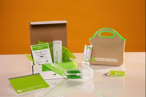

Playing off the idea that lunch is the perfect relationship builder, the distributor sent prospects a lunch bag with a note explaining how promotional marketing is ideal for building relationships in business. The kit included familiar lunchtime items: a stainless steel tumbler, placemat, cutlery and a Power Bar packaged as a power bank, as well as a booklet with information about the company. Each item was imprinted with one of the four goals of promotional product marketing: encourage growth, reward success, create awareness and invite opportunity. The 10-page booklet expanded on these themes. In addition, all items had the J+G! logo, indicating the company’s affiliation with Geiger, and that together, they are better for their customers. The items were packed in lime-green tissue paper and set within a plain, white shipping box with a colorful label announcing, “Especially for you from The Creative J.” The boxes were mailed via USPS Priority Mail.
Out of the seven kits sent during the awards’ eligibility period, one prospect turned into a $400,000 company store program, one has placed a few orders, one moved their marketing to the company and placed $7,000 in orders within six months, including a quarterly company apparel program. One large company has expressed interest in The Creative J’s corporate programs and is in the initial phases of evaluating its capabilities.
––––––––––––––––––––––––––––––––––––––––––––––––––––––––––––––––––––––
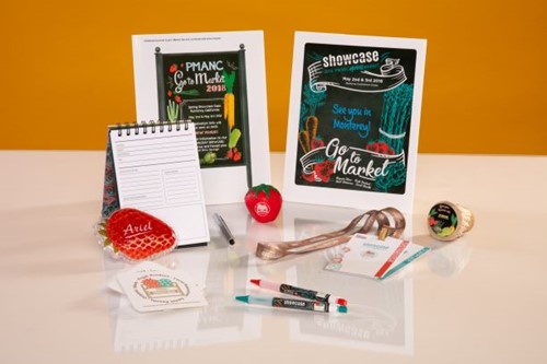

The objective of the promotion was to implement a marketing campaign that would renew interest in the regional association’s annual trade show. Eight months before the show date, the team created an exhibitor prospectus which featured a “Go to Market’ logo that incorporated the key values of the campaign: fresh product, local resources and sweet results. Photos of the $60 million dollar ‘fresh and new’ renovation of the show venue helped to alleviate any negative feelings about the show’s previous location.
A mobile app was developed for distributor attendees and launched one month before the show with important information about the show and to encourage pre-show engagement and social media interaction. Products used to create awareness included stress toys, seed packets, printed badges and lanyards, a program journal, aqua pearls and coasters.
The target audience included 305 regional and national suppliers, multi-line representatives and business service companies and 1,030 distributors in Northern California.
PMANC Board members visited high-profile distributor companies six weeks prior to the event to encourage their entire teams to attend. They brought baskets of fresh strawberries and a berry pie for the team to enjoy. They also distributed postcards with information about the show and professional development events. Board members posed for group photos with the distributor teams and immediately posted them to all social media channels to generate interest and increase awareness for the show.
The campaign, which cost $5,424, generated a lot of attention. The original exhibitor floor plan had to be reconfigured to include more booths and the inventory was sold out eight weeks before the show. Fifty-one exhibitors, who had not exhibited the year before, exhibited at the 2018 show and 14 of those had never before exhibited at a PMANC show. Distributor attendance increased by 21% over the previous year. Suppliers were very impressed with the ‘quality’ of the distributors who attended and posted on social media that the show was a great success. The initial email announcing the registration open for distributors exceeded industry standards with a 26 percent open rate and a 16 percent click-through rate.
––––––––––––––––––––––––––––––––––––––––––––––––––––––––––––––––––––––
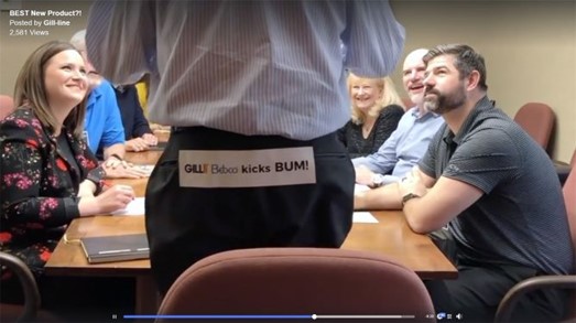

As the inventor of the bumper sticker, Gill wanted to capitalize on the product’s popularity and also remind people that freedom of speech is important. A plan for a spoof new product video was set in motion for April Fool’s Day using the industry's only ultra removable adhesive—which is a big selling feature for end users who want to ensure bumper sticker don’t adhere permanently. The company recruited employees, family members and even pets to highlight its products and did it in a fun and playful manner.
Gill targeted its full customer base with emails and drove distributors to its website to request samples and additional information. The program resulted in an open rate of 15 percent and a click-thru rate of 18 percent.
––––––––––––––––––––––––––––––––––––––––––––––––––––––––––––––––––––––

In collaboration with distributor Jack Nadel International, Pop! Promos created a 32-page sunglasses catalog that highlighted all sunglasses and their capabilities. The distributor used this piece along with a custom, Pantone matched sunglasses self-promo to highlight and educate its sales reps on the products’ styles and capabilities.
The piece highlighted the message that the sunglasses in the Pop! Promos line can truly have endless imprint and design capabilities, and can be applicable to any event or giveaway.
––––––––––––––––––––––––––––––––––––––––––––––––––––––––––––––––––––––
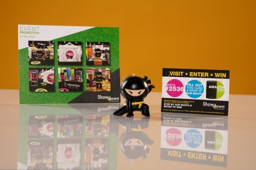

Showdown Displays increased its customer engagement at trade shows by creating a costumed ninja mascot named Dash who was positioned as a silent partner to distributors. The mascot attended trade shows and the company also handed out stress relievers shaped like Dash along with sign-up cards that allowed attendees to enter for a chance to win an Amazon Echo. The campaign was a resounding success, with a substantial increase in booth traffic, leads and active accounts.
The campaign ran in January 2018, and was directed to attendees at The PPAI Expo and the ASI Show with a total reach of about 8,000 people.
Dash greeted people before they entered the show, danced for their entertainment and informed them about the Amazon Echo offer. Showgoers were also invited to take photos with Dash and post those to social media using a hashtag created for the "Silent Partner" ninja campaign. This allowed us to expand the campaign's reach far beyond the show floor.
The combination of the mascot costume, the stress relievers and the giveaway led to favorable comments from distributor partners and drove sales through Q1 of 2018. During this period, lead generations were substantial, active accounts were at a historical high and booth traffic, and scanned leads were up about 34 percent over the previous year.
––––––––––––––––––––––––––––––––––––––––––––––––––––––––––––––––––––––
Tina Berres Filipski is editor of PPB.