
Data Visualization
Try this exercise: Think of all the metrics you rely on every day to run your business profitably—order count, cash on hand, total sales, accounts receivable collections, loan balance, payroll, sales by product line, order backlog, actual vs budget, year to date actuals vs the previous year, etc. Whether you use an executive dashboard system, computer generated reports or some other system, every successful business has some process in place to monitor these key financial indicators.
Next, think about the information you would like to have but are not getting in any of your reports. These are the numbers you don’t know—and it’s driving you crazy because you know they affect your sales and performance and cost you money, but you can’t put your finger on exactly what or why. I’m talking about knowable unknowns—meaningful, actionable information you could access or capture and evaluate, but you don’t.
The challenge of knowable unknowns is not a new business problem. A famous department store pioneer named John Wanamaker once said, “Half the money I spend on advertising is wasted; the trouble is I don’t know which half.” Wanamaker died in 1922. How many of us are vexed by similar issues now 100 years later? Instead of advertising, maybe your challenge is figuring out why a product line is declining when the same items did so well last year; why a previously hot account has suddenly turned cold or how much money you’re losing in production due to inefficiencies, waste or mistakes.
For most of my career, I’ve worked as a turnaround CEO—a hired gun with a mandate to resuscitate underperforming businesses. To be successful in turnarounds, you have to be able to look deeply into every area of a business to determine whether to keep it, jettison it, reorganize it or nurture it. On paper, this is a straightforward process. In practice, it is more difficult. A key problem is getting access to relevant data to be able to evaluate performance. While most businesses have computer systems to process orders and manage accounting functions, getting access to the data has historically been limited to canned reports or the painful process of getting a programmer to create custom reports. But even with custom reports, you still can’t evaluate different scenarios without somehow getting that data into a spreadsheet.
Faced with this dilemma 10 years ago, I found a gem of a solution in what was then a nascent area of computing called BI, short for business intelligence systems. Think of BI as a key that can unlock insights contained in the terabytes of data stored across a company’s various computer systems—insights that can help you perform better, grow faster and generate more profits. BI enables you to organize, probe and visualize your data with speed and simplicity. The insights it enables are “lightbulb moments”—those flashes when you gain a clear understanding of what is affecting your company’s growth and profitability. The first time you see your data come alive in a BI system is truly an “aha” experience.
What Exactly Is A Business Intelligence System?
Research giant Gartner defines BI as an umbrella term that includes the applications, infrastructure, tools and best practices that enable access to and analysis of information to improve and optimize decisions and performance. In 2017, Gartner pegged BI spending worldwide at $18.3 billion. This introductory article will focus on commonly available BI tools you can use right out of the box and give you an overview of how they work and what you can do with them.
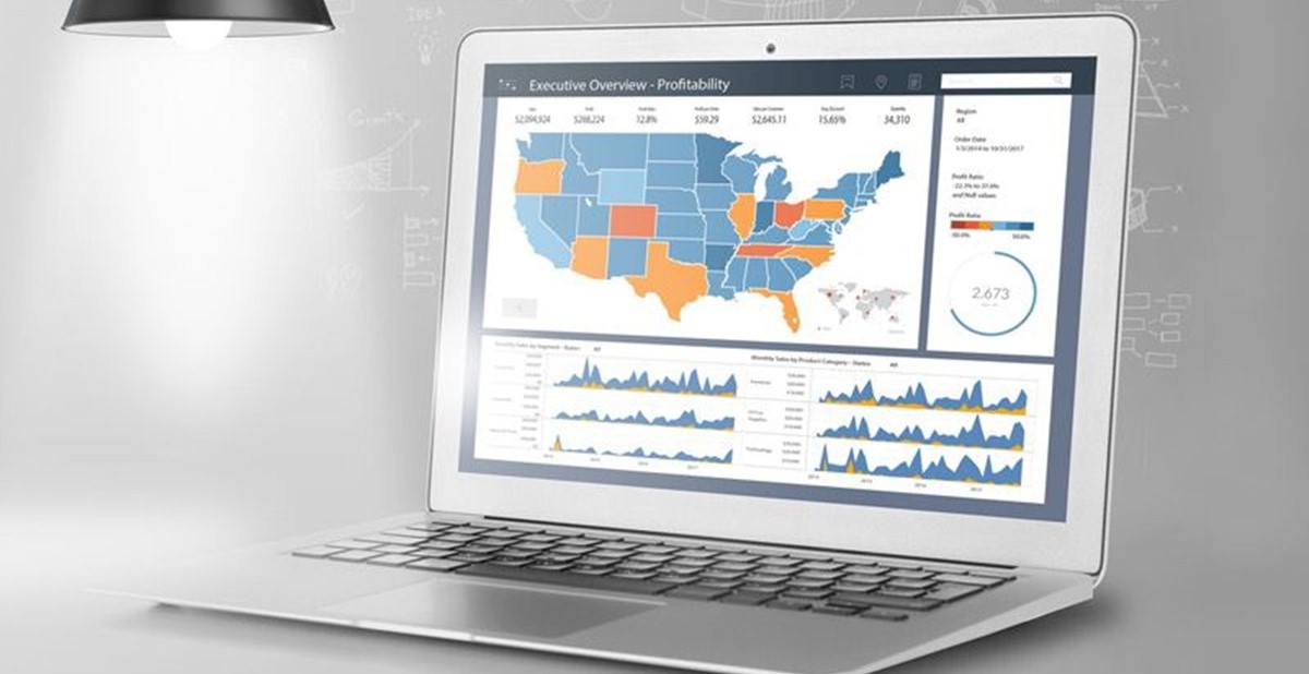
The market leaders are Power BI by Microsoft and Tableau by Tableau Software. Each of these programs has the ability to connect to a variety of databases, including data in spreadsheets. In addition to their extensive analytic capabilities, both are considered data visualization programs for their ability to display data in a stunning array of intuitive and interactive graphics—dashboards, graphs, charts and visuals of all types. Tableau was used for the following examples, but the concepts apply to all BI programs.
How Does A BI Program Work?
Similar to Excel, BI programs allow you to create multiple worksheets in a workbook, but instead of importing or manually entering data into spreadsheet cells, BI programs require you to “connect” to a data source such as your company’s computer system, a spreadsheet, your call center or even your website. When you connect to data, the BI program classifies each field in your data as either a dimension or a measure. Measures are numeric fields on which you can perform math, such as adding up revenue, expenses or order count. Dimensions are fields that characterize measures; e.g, products, customers or sales region. Sales revenue displayed in the measure field without any dimension simply displays the total revenue for all the records in the database. But when shown in combination with a dimension, you will see the revenue broken down by whatever dimension you choose. The products dimension shows revenue for each product you sell. The sales region dimension shows revenue for each of your sales regions, and the customer dimension shows revenue by customer. You can also show multiple dimensions together for additional insights. By combining products, customers and sales regions together with the revenue measure, you can see a detailed breakdown of revenue by customer for each region and product.
What Can You Do With A BI Program?
Now that you know a little about how BI programs work, let’s discuss what you can do with one. When you want to display data in a BI program, you simply drag data fields onto the worksheet. You can display your data in columnar format, like a spreadsheet, or as a graphic. Numeric formats can be very informative, but graphics can help data come alive in ways that help you visualize trends, especially when the underlying data consist of thousands or even millions of records. Most users choose a combination of both, depending of what the worksheet is designed to analyze or communicate. The real magic happens when you combine multiple sheets onto a single dashboard, each in its own window. In multi-window dashboards, as you select something in one window, the other windows can be programmed to automatically show you related underlying data.
As an example, say you’re a supplier who sells products in multiple categories and you want a dashboard that enables you to analyze your sales each day by category, by customer, by product and by order. In this case you would create a dashboard with five windows. In window one, you would show your daily revenue, perhaps comparing each day this year with the same day last year. In window two, you show revenue by product. In window three, you show sales by customer. In window four, you show sales by product category. In window five, you show sales by order. Each window shows the same total revenue, but from a different perspective.
Start your analysis by looking at your business by customer. Click on a customer in window three, and the other windows will automatically filter to that customer’s records. Window one will still show daily sales filtered to show only the sales from the customer you selected in window three. Window two will filter to show only the products that customer has purchased. Window four will show the product categories that customer is purchasing and window five will show you only that customer’s orders. This customer-centric view is exactly the information you want before making a sales call on this customer, but it also provides much more. It shows you the categories and products the customer has been purchasing, including the number of orders and average order size, and lets you compare these metrics year over year. Are sales increasing? Are orders increasing but revenue is not? Did the customer previously purchase certain categories from your business but is now getting those from a competitor? These and similar analytic questions can form the basis of a strategic approach to selling each account, or group of accounts if you’re evaluating a buying group or a national account.
Now, change your perspective to look at your results by product. Click on a product in window two. Window one will now be filtered to show your revenue for that product day by day. Window three will show you which customers are buying that product. If you choose to display two years of data, you’ll be able to see who bought the product last year but didn’t buy this year, so you can more effectively target your sales plan. Window five will show you every order, so you can compare last year’s order quantity to this year’s or any other related metrics to help you understand how the market has changed over time.
These examples are just a hint of what a BI implementation can do to help you gain insights into your business. Once you see what is possible through data visualization and BI technology, you will undoubtedly want dashboards for every key performance area of your business. Distributors will likely track performance and profitability by account, order, sales rep, customer store and market segments. Other metrics, like Request For Proposal and bid status, sales closing rates, order-to-ship times, supplier score card and visualization of your company’s financial statements are also valuable.
Suppliers can track revenue and order flow by all the metrics mentioned above as well as the profitability of buying group programs, sampling programs, rebate arrangements, inventory ROI, territory performance, customer spend, national account programs, product segments, new product introductions, factory productivity and shipping performance, just to name a few.
Data visualization through BI has vastly improved the ability of everyone in business to identify opportunities, evaluate performance, highlight trends, uncover hidden profit leaks and eliminate knowable unknowns. Many companies create BI dashboards and visualizations for every department, from reps in the field to production managers. You don’t need to know how to program a worksheet to be able to use one effectively. Whether you access a BI worksheet from a desktop, tablet or smartphone, the insights you can gain from these tools can focus your efforts on the data that will have the greatest impact on your business and maximize your results, whatever your job.
In the late ’80s, I had the privilege of attending a three-week program at Harvard Business School (HBS) specifically for CEOs of small businesses. Our marketing course was taught by legendary HBS professor Marty Marshall. To Marshall, all of marketing could be boiled down to three words: “What’s going on?” If Marshall were alive today, he would love BI because there’s no better way for businesses to answer his proverbial question. BI tells you what’s going on.
---
Rick Brenner, MAS+, is president of RFBrenner LLC in Mamaroneck, New York. He consults with distributors and suppliers on a wide range of strategies to improve growth and profitability, including merger and acquisitions advising. As an accomplished Tableau developer and long-term user of the product, Brenner works with industry firms to implement Tableau.
Brenner served on the PPAI board for five years and was chair in 2015. Reach him at
rick.brenner@logicaladvisors.com.